QwtPyPlot — Matplotlib-Style Plotting Interface
QwtPyPlot is a high-level wrapper class in Qwt 7 that provides a pyplot-like plotting interface for C++ users familiar with matplotlib. It delegates internally to QwtFigure, QwtPlot, QwtPlotFactory, QwtPlotStyling, and other existing classes without modifying any underlying implementation.
Overview
classDiagram
    class QwtPyPlot {
        +QwtPyPlot(QwtFigure*)
        +QwtPyPlot(QwtPlot*)
        +gcf() QwtFigure*
        +gca() QwtPlot*
        +sca(QwtPlot*)
        +subplot(rows, cols, index)
        +plot(x, y, fmt)
        +scatter(x, y, size, color)
        +bar(values, color)
        +hist(data, bins, color)
        +imshow(data, cmap)
        +contour(data, levels)
        +fillBetween(x, y1, y2)
        +setTitle(title)
        +setXLim(min, max)
        +grid(show)
        +legend()
        +savefig(filename, dpi)
        +show()
    }

    class QwtFormatString {
        +parse(fmt) QwtFormatString
        +color
        +marker
        +lineStyle
        +noLine
    }

    QwtPyPlot ..> QwtFigure : wraps
    QwtPyPlot ..> QwtPlot : operates on
    QwtPyPlot ..> QwtPlotFactory : delegates
    QwtPyPlot ..> QwtPlotStyling : delegates
    QwtPyPlot ..> QwtFormatString : parses
| Class |
Responsibility |
Header |
QwtPyPlot |
Matplotlib pyplot-style plotting interface |
<QwtPyPlot> |
QwtFormatString |
Matplotlib format string parser |
<QwtPyPlot> |
Core Concepts
QwtPyPlot maintains a "current axes" pointer (similar to matplotlib's gca()), so all plotting methods operate on the current axes:
| matplotlib Concept |
QwtPyPlot / Qwt Equivalent |
matplotlib.figure.Figure |
QwtFigure |
matplotlib.axes.Axes |
QwtPlot |
pyplot module |
QwtPyPlot class |
plt.gcf() / plt.gca() |
QwtPyPlot::gcf() / gca() |
plt.subplot() |
QwtPyPlot::subplot(rows, cols, index) |
fig.savefig() |
QwtPyPlot::savefig(filename, dpi) |
Two Usage Modes
 1
 2
 3
 4
 5
 6
 7
 8
 9
10
11
12
13
14
15
16
17
18
19
20 | #include <QwtFigure>
#include <QwtPyPlot>
QwtFigure* fig = new QwtFigure;
QwtPyPlot plt(fig);
// Create subplot 1 in a 2×1 grid
plt.subplot(2, 1, 1);
plt.plot(x, y, "r-o", "Temperature");
plt.setTitle("Sensor Data");
plt.grid(true);
plt.legend();
// Create subplot 2
plt.subplot(2, 1, 2);
plt.bar({10, 20, 30, 40}, "b", "Sales");
plt.setYLabel("Value");
plt.savefig("output.png", 300);
fig->show();
|
Mode 2: QwtPlot Single-Plot Mode
| #include <QwtPlot>
#include <QwtPyPlot>
QwtPlot* plot = new QwtPlot;
QwtPyPlot plt(plot);
plt.plot(x, y, "b--");
plt.scatter(x2, y2, 50, "r");
plt.setTitle("Quick Plot");
plot->show();
|
QwtFormatString parses matplotlib-style format strings, supporting combinations of color, marker, and line style:
| Format: [color][line_style][marker]
Examples: "r-o" → red solid line + circle marker
"b--" → blue dashed line
"g^:" → green dotted line + upward triangle
"ko" → black circles (no line)
|
Color Characters
| Char |
Color |
Char |
Color |
b |
Blue |
m |
Magenta |
g |
Green |
y |
Yellow |
r |
Red |
k |
Black |
c |
Cyan |
w |
White |
Marker Characters
| Char |
Marker |
Char |
Marker |
o |
Circle |
x |
Cross (×) |
s |
Square |
+ |
Plus (+) |
^ |
Triangle up |
* |
Star |
v |
Triangle down |
. |
Dot |
D |
Diamond |
|
|
Line Styles
| Symbol |
Style |
- |
Solid |
-- |
Dashed |
-. |
Dash-dot |
: |
Dotted |
Matplotlib Behavior
When only a marker is specified without a line style (e.g. "ro"), the line is automatically hidden, showing only marker points. This matches matplotlib behavior.
Plotting Methods
Basic Plots
plot() — Line Plot
| // y-only (x auto-generated as 0, 1, 2, ...)
plt.plot({1, 4, 2, 5}, "r-o");
// x-y data
plt.plot(x, y, "b--", "Label");
// QPointF data
QVector<QPointF> data = {{0,1}, {1,3}, {2,2}};
plt.plot(data, "g^:");
|
scatter() — Scatter Plot
| // Parameters: x, y, marker size, color, label
plt.scatter(x1, y1, 30, "r", "Group A");
plt.scatter(x2, y2, 50, "b", "Group B");
|
bar() — Bar Chart
| // y-only values (x = index)
plt.bar({10, 20, 30, 40}, "c");
// x-y data with width
plt.bar(x, values, 0.8, "b", "Sales");
|
hist() — Histogram
| // Automatic binning (default 10 bins)
plt.hist(data, 20, "m", "Distribution");
|
imshow() — Heatmap
| // 2D matrix data with various colormaps
QVector<QVector<double>> matrix = ...;
plt.imshow(matrix, "viridis");
|
Supported colormaps: "viridis", "hot", "cool", "jet", "gray"
contour() — Contour Lines
| // Auto-generate 10 contour levels
plt.contour(data);
// Custom contour levels
plt.contour(data, {0.2, 0.4, 0.6, 0.8}, "hot");
|
fillBetween() — Filled Area
| // Parameters: x, y1, y2, color, alpha
plt.fillBetween(x, yLower, yUpper, "blue", 0.3);
|
errorbar() — Error Bars
| plt.errorbar(x, y, yerr, "r-", "Measurement");
|
quiver() — Vector Field
| plt.quiver(x, y, u, v, "k");
|
candlestick() — OHLC Chart
| QVector<QwtOHLCSample> ohlcData = ...;
plt.candlestick(ohlcData, "Stock");
|
Decorative Elements
| Method |
Description |
Example |
grid(show, minor) |
Grid lines |
plt.grid(true, true) |
axhline(y, fmt) |
Horizontal reference line |
plt.axhline(0, "k--") |
axvline(x, fmt) |
Vertical reference line |
plt.axvline(5, "r:") |
axhspan(y1, y2, color, alpha) |
Horizontal zone highlight |
plt.axhspan(2, 4, "yellow", 0.2) |
axvspan(x1, x2, color, alpha) |
Vertical zone highlight |
plt.axvspan(3, 7, "blue", 0.1) |
legend(loc) |
Legend |
plt.legend() |
annotate(text, xy, xytext) |
Arrow annotation |
plt.annotate("Peak", peak, label) |
Axis Configuration
Titles and Labels
| plt.setTitle("My Plot");
plt.setXLabel("Time (s)");
plt.setYLabel("Amplitude");
|
Axis Limits and Scale
| // Set axis limits
plt.setXLim(0, 100);
plt.setYLim(-5, 5);
// Logarithmic scale
plt.setXScale("log");
plt.setYScale("log");
// Back to linear
plt.setXScale("linear");
|
Ticks
| // Custom tick positions
plt.setXTicks({0, 2.5, 5, 7.5, 10});
plt.setYTicks({-1, 0, 1});
// Invert axis direction
plt.invertXAxis();
plt.invertYAxis();
|
Subplot Layout
| QwtFigure* fig = new QwtFigure;
QwtPyPlot plt(fig);
// subplot(rows, cols, index) — 1-based index
plt.subplot(2, 2, 1); // Row 1, Column 1
plt.subplot(2, 2, 2); // Row 1, Column 2
plt.subplot(2, 1, 2); // Row 2, spans 2 columns
|
Twin Axes (Dual Y/X)
| plt.subplot(1, 1, 1);
plt.plot(x, temp, "r-", "Temperature");
plt.setYLabel("°C");
// Create twin Y-axis on right
QwtPlot* ax2 = plt.twinx();
plt.sca(ax2); // Switch to new axes
plt.plot(x, humidity, "b--", "Humidity");
plt.setYLabel("%");
|
Tight Layout
| plt.tightLayout(); // Align Y-axes across all subplots
|
Appearance
| // Set figure background color
plt.setFaceColor("lightgray");
// Set canvas background color
plt.setAxesColor("white");
|
Output and Interaction
Save to File
| plt.savefig("output.png"); // Default DPI
plt.savefig("output.png", 300); // 300 DPI
|
Show Window
Interaction Controls
| plt.enablePan(true); // Enable drag panning
plt.enableZoom(true); // Enable rubber-band zoom
|
Complete Example
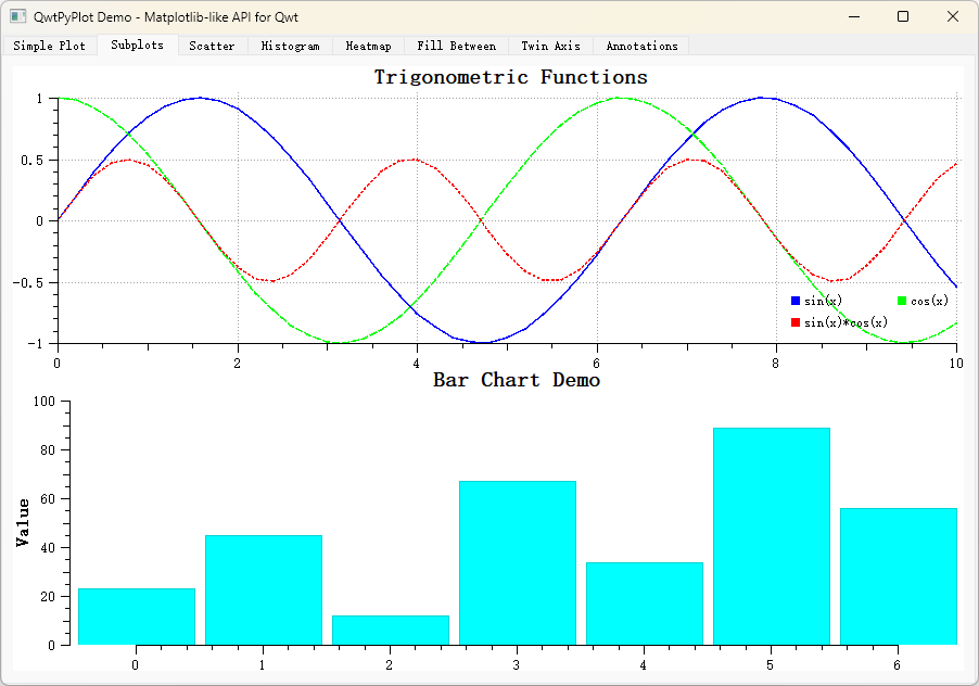
The following example demonstrates a multi-subplot application with line plots, scatter plots, and histograms:
 1
 2
 3
 4
 5
 6
 7
 8
 9
10
11
12
13
14
15
16
17
18
19
20
21
22
23
24
25
26
27
28
29
30
31
32
33
34
35
36
37
38
39
40
41
42
43
44
45 | #include <QApplication>
#include <QwtFigure>
#include <QwtPyPlot>
#include <cmath>
int main(int argc, char* argv[])
{
QApplication app(argc, argv);
QwtFigure* fig = new QwtFigure;
QwtPyPlot plt(fig);
// Generate data
QVector<double> x, sinY, cosY;
for (int i = 0; i <= 100; i++) {
double t = i * 0.1;
x.append(t);
sinY.append(std::sin(t));
cosY.append(std::cos(t));
}
// Subplot 1: Line plot
plt.subplot(2, 1, 1);
plt.plot(x, sinY, "r-", "sin(x)");
plt.plot(x, cosY, "b--", "cos(x)");
plt.setTitle("Trigonometric Functions");
plt.grid(true);
plt.legend();
// Subplot 2: Histogram
plt.subplot(2, 1, 2);
QVector<double> randomData;
for (int i = 0; i < 500; i++) {
randomData.append(std::sin(i * 0.1) * 10 + (i % 7));
}
plt.hist(randomData, 20, "c");
plt.setTitle("Distribution");
plt.tightLayout();
plt.savefig("demo.png", 300);
fig->resize(800, 600);
fig->show();
return app.exec();
}
|
API Reference
Construction and State
| Method |
Description |
QwtPyPlot(QwtFigure*) |
Construct: multi-subplot mode |
QwtPyPlot(QwtPlot*) |
Construct: single-plot mode |
gcf() |
Get current Figure |
gca() |
Get current axes |
sca(QwtPlot*) |
Set current axes |
Plotting Methods
| Method |
Return Type |
Description |
plot(y, fmt, label) |
QwtPlotCurve* |
Y-only line plot |
plot(x, y, fmt, label) |
QwtPlotCurve* |
X-Y line plot |
plot(data, fmt, label) |
QwtPlotCurve* |
QPointF line plot |
scatter(x, y, size, color, label) |
QwtPlotCurve* |
Scatter plot |
bar(values, color, label) |
QwtPlotBarChart* |
Bar chart |
bar(x, values, width, color, label) |
QwtPlotBarChart* |
X-Y bar chart |
hist(data, bins, color, label) |
QwtPlotHistogram* |
Histogram |
boxplot(data, label) |
QwtPlotBoxChart* |
Box plot |
fillBetween(x, y1, y2, color, alpha) |
QwtPlotIntervalCurve* |
Filled area |
errorbar(x, y, yerr, fmt, label) |
QwtPlotIntervalCurve* |
Error bars |
imshow(data, cmap, vmin, vmax) |
QwtPlotSpectrogram* |
Heatmap |
contour(data, levels, cmap) |
QwtPlotSpectrogram* |
Contour lines |
quiver(x, y, u, v, color) |
QwtPlotVectorField* |
Vector field |
candlestick(data, label) |
QwtPlotTradingCurve* |
OHLC chart |
Axis Configuration
| Method |
Description |
setTitle(title) |
Set plot title |
setXLabel(label) |
Set X-axis label |
setYLabel(label) |
Set Y-axis label |
setXLim(min, max) |
Set X-axis limits |
setYLim(min, max) |
Set Y-axis limits |
setXScale(scale) |
Set X-axis scale ("linear" / "log") |
setYScale(scale) |
Set Y-axis scale |
setXTicks(ticks, labels) |
Set X-axis ticks |
setYTicks(ticks, labels) |
Set Y-axis ticks |
invertXAxis() |
Invert X-axis |
invertYAxis() |
Invert Y-axis |
| Method |
Description |
subplot(rows, cols, index) |
Create subplot (1-based index) |
addAxes(rect) |
Add axes at normalized position |
twinx(host) |
Create twin Y-axis |
twiny(host) |
Create twin X-axis |
tightLayout() |
Apply tight layout |
Output and Interaction
| Method |
Description |
savefig(filename, dpi) |
Save figure to file |
show() |
Show widget window |
enablePan(enable) |
Enable/disable panning |
enableZoom(enable) |
Enable/disable zooming |
Related Examples
A complete example is located in examples/2D/pyplot/, containing 8 tabs demonstrating various QwtPyPlot features.
Screenshot of the PyPlot example: