Ribbon Button Layout Guide
- ✅ Strategy Pattern architecture: v2.7.0+ introduces SARibbonButtonLayoutStrategy hierarchy, clean layout logic separation
- ✅ Two layout schemes: Word-wrap (Office style) and non-wrap (WPS style), choose by language context
- ✅ Three button sizes: Large(32×32)/Medium/Small(20×20), icon size auto-adapts to button mode
- ✅ Single-row horizontal layout: v2.8.0 adds enableIconRightText property, icon-left text-right horizontal arrangement
- ✅ Binary search line-break: Long text auto-wraps with up to 10 iterations for optimal width
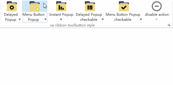
- ✅ MenuButtonPopup vertical split: Ribbon-specific button mode, top half executes default action, bottom pops menu
The Ribbon UI cannot be implemented with a simple QTabBar + QToolButton combination mainly because ribbon buttons are rendered in a special way. They differ significantly from classic menu buttons. The difference is obvious when a menu is present, especially in MenuPopup mode: classic toolbars split the button horizontally (icon | arrow), while Ribbon splits it vertically (icon on top, text + arrow at the bottom).
SARibbon uses SARibbonToolButton, a subclass of QToolButton with custom painting.
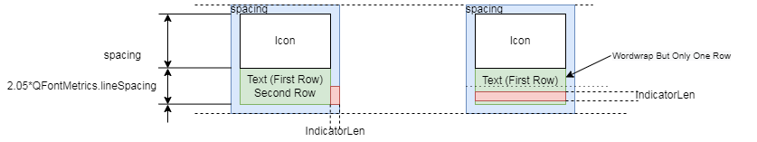
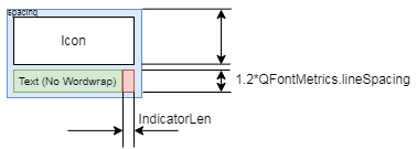
Each button is divided into three rectangles:
- Icon area
- Text area
- Indicator (drop-down arrow) area
There are two layout strategies, chosen automatically according to word-wrap mode.
Layout Strategy Architecture (v2.7.0+)
Starting from v2.7.0, the layout calculation of SARibbonToolButton has been refactored using the Strategy Pattern, introducing the SARibbonButtonLayoutStrategy class hierarchy:
classDiagram
    class SARibbonButtonLayoutStrategy {
        <<abstract>>
        +layout(SARibbonButtonLayoutContext*) QRectList
        +iconRect() QRect
        +textRect() QRect
        +indicatorRect() QRect
    }
    class SARibbonLargeButtonLayoutStrategy {
        +layout(context) QRectList
        +iconRect() QRect
        +textRect() QRect
        +indicatorRect() QRect
    }
    class SARibbonSmallButtonLayoutStrategy {
        +layout(context) QRectList
        +iconRect() QRect
        +textRect() QRect
        +indicatorRect() QRect
    }
    class SARibbonButtonLayoutContext {
        +buttonSize : QSize
        +iconSize : QSize
        +spacing : int
        +wordWrap : bool
        +hasMenu : bool
        +text : QString
        +fontMetrics : QFontMetrics
    }
    SARibbonButtonLayoutStrategy <|-- SARibbonLargeButtonLayoutStrategy
    SARibbonButtonLayoutStrategy <|-- SARibbonSmallButtonLayoutStrategy
    SARibbonButtonLayoutStrategy --> SARibbonButtonLayoutContext : uses
This design enables:
- Cleaner separation of layout logic
- Easy extension for new button type layouts
- Better unit test support
The layout context SARibbonButtonLayoutContext encapsulates all parameters needed for layout calculation, including spacing, icon sizes, and word-wrap settings.
Button Icon Settings
Ribbon buttons come in three sizes: large, medium, and small. Large button icons are 32x32, while medium and small button icons are 20x20.
SARibbonBar provides the following functions for setting icon sizes for large and small buttons:
1 2 3 4 5 6 | |
These functions allow you to set your own icon sizes when customizing the layout.
Example
You can run the example/MainWindowExample and manually adjust the sizes for testing.
Word-Wrap Mode (Office Word style)
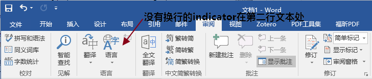
When word-wrap is on, the text area occupies two lines.
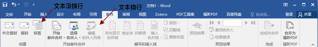
- If the text fits on one line, the second line stays blank (first panel above).
- If the text wraps, it fills the second line (second panel).
- When a menu is present, the arrow is placed at the right end of the second line, even if the text is short.
Layout in SARibbonToolButton:
Enable / disable wrapping globally:
1 | |
Automatic line-break algorithm (Optimized in v2.7.0)
For long English labels, the button uses a binary search algorithm (up to 10 iterations) to find the optimal width, which is more efficient than the previous linear approach.
Algorithm logic:
- Start by halving the text width (1/2)
- Use binary search within the [1/2, original width] range
- Ensure the text fits within two lines
Warning
You can force a break by inserting \n in the text.
If \n is present, the automatic algorithm is skipped.
Tip
In single-line mode any \n characters are ignored.
Non-Wrap Mode (WPS style)
WPS keeps everything on one line; the arrow sits at the far right.
This mode is perfect for short Chinese labels, but may truncate long English words.
If your UI is mainly English, prefer word-wrap mode; for Chinese, non-wrap looks cleaner.
Layout in SARibbonToolButton:
Building a Visually Pleasing Ribbon
When all labels are short and no menus are attached, word-wrap mode leaves an empty second line on almost every button.
Too much blank space can look unbalanced:
Remedies:
- Mix button sizes – e.g. two large buttons + three small ones in the same row.
- Force a break with
\n, especially for 4-character titles (two + two).
Button Layout Best Practices
The following table summarizes recommended layout approaches for different scenarios:
| Scenario | Recommended Approach | Description |
|---|---|---|
| Chinese interface | Non-wrap mode | Chinese characters are concise, single-line display works well, use setEnableWordWrap(false) |
| English interface | Word-wrap mode | English words are longer, wrapping ensures full display, use setEnableWordWrap(true) |
| Space extremely limited | Single-row mode + enableIconRightText | Icon-left text-right horizontal layout, use RibbonStyleCompactSingleRow + setEnableIconRightText(true) |
| Important features | Large buttons | Large icon + text, immediately visible |
| Common features | Medium buttons | Moderate size, occupies 2 rows in 3-row mode |
| Auxiliary features | Small buttons | Small icons, saves space |
| Related operations group | ButtonGroup | Use SARibbonButtonGroupWidget for tight grouping, e.g. alignment button group |
| Short text without menu | Mix button sizes | 2 Large + 3 Small to avoid blank lines |
| Four-character Chinese button | Manual line break | Use \n to force line breaks in pairs, e.g. "File\nManage" |
Single-row Mode Button Rendering (v2.8.0+)
Starting from v2.8.0, SARibbon adds the single-row layout mode (SingleRowMode). In this mode:
- All buttons (Large/Medium/Small) use Small horizontal layout: icon on the left, text on the right
SARibbonBar::setEnableIconRightText(true)forces all buttons to use horizontal icon-left, text-right layout (also usable in non-single-row modes)- Text does not wrap; long text will be truncated
How to enable:
1 2 3 4 5 6 | |