Creating a Ribbon Interface
Ribbon Component Creation Flow
From obtaining SARibbonBar to creating UI elements, follow this hierarchical creation flow:
flowchart TD
    A[Obtain SARibbonBar] --> B[Create SARibbonCategory]
    B --> C[Create SARibbonPanel]
    C --> D{Choose component type}
    D -->|Button| E[addLargeAction/addMediumAction/addSmallAction]
    D -->|Menu button| F[addLargeAction + ToolButtonPopupMode]
    D -->|Widget| G[addSmallWidget/addLargeWidget]
    D -->|Gallery| H[addGallery + addCategoryActions]
    D -->|Button group| I[Create SARibbonButtonGroupWidget + addWidget]
    B -->|Context category| J[addContextCategory + addCategoryPage]
    A --> K[Configure QuickAccessBar]
    A --> L[Configure RightButtonGroup]
    A --> M[Configure ApplicationButton]
    J --> N[showContextCategory/hideContextCategory]
Category
There are two ways to create a category page:
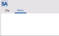
Method 1: Adding via ribbonbar
1 2 3 4 5 | |
The above code will add a tab page named Main.
Method 2: Create first, then add
1 2 3 4 5 6 7 | |
Panel
Creating a Panel and Adding Actions
A panel is a group of functions under a category. You can create a panel using the addPanel method of Category and add function buttons using the addAction series of methods.
Each category must have at least one panel.
1 2 3 4 5 6 7 8 9 10 11 12 13 14 15 16 17 18 19 20 21 | |
Creating Menus
In a Ribbon interface, menus are an important way to organize complex functions. SARibbon allows you to add menus to panels in the form of buttons with different styles. The main difference lies in the button's popup mode (QToolButton::ToolButtonPopupMode), which determines how users interact with the menu.
SARibbon supports 3 main popup modes, and you can choose the most appropriate one according to functional requirements:
-
DelayedPopup:
When the user clicks the button, the default action of the button is executed. When the user presses and holds the button, the menu pops up (hold until the menu pops up, the default action of the button will not be executed). This mode is mainly applicable when the main function of the button is to perform a common operation, and the menu provides secondary or advanced options.
-
MenuButtonPopup:
This is the most distinctive mode of the Ribbon interface. The button is visually divided into two parts: upper and lower. Clicking the upper part (icon area) of the button executes the default action; clicking the lower part (text or drop-down arrow area) directly pops up the menu without executing the default action. When the mouse hovers, the two parts will have different highlighting effects.
This is the most recommended mode, especially for Office-style applications. It clearly distinguishes between primary and secondary operations, providing the best user experience. For example, a "Paste" button: clicking the icon area performs standard pasting, and clicking the drop-down arrow area pops up options such as "Paste Special" and "Paste as Plain Text".
-
InstantPopup:
When the user clicks any part of the button, the menu pops up immediately without executing the default action of the button. This mode is suitable when the function of the button is completely defined by its drop-down menu, with no single "default" operation. For example, a "Page Layout" button that, when clicked, directly pops up a menu with options for setting margins, paper orientation, etc.
There are two methods to add menus in SARibbon. The first is to call the addXXAction function:
1 2 3 4 5 6 | |
Using this method, the action contains the menu, and the second parameter clearly specifies the button style.
Here is an example of using this method:
1 2 3 4 5 6 7 8 9 10 11 12 13 14 15 16 17 18 19 20 | |
The above code will create the following three menu buttons:
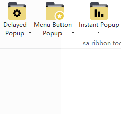
These three buttons share one menu.
SARibbon also provides another interface to quickly add menus (methods located in the SARibbonPanel class):
1 2 3 4 5 6 7 8 9 10 | |
These functions actually use the menu's own action for management, so there's no need to create a separate action.
Note
These methods will modify some properties (icon/text/objectName) of menu->menuAction(). If you need to retain custom values, please set them in advance.
Panel Layout Placeholder Description
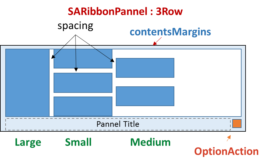
SARibbon panels currently have 3 types of placeholder markers. When you call addLargeAction, addMediumAction, or addSmallAction, you are not only adding a button but also specifying its "placeholder size" in the grid layout.
- Large Action: Occupies 2 or 3 rows in height (depending on whether it's in two-row or three-row mode), displaying a large icon and text.
- Medium Action: Occupies 1 or 1.5 rows in the grid (depending on whether it's in two-row or three-row mode), usually displaying an icon and text.
- Small Action: Occupies 1 row in height.
These row proportions will have different rendering effects in different layout schemes.
SARibbonPanel supports three layout schemes: 3-row mode, 2-row mode, and single-row mode (new in v2.8.0). You can set different layout styles through the SARibbonBar::setRibbonStyle function.
For the 3-row mode, the effects of the above three row placeholders are as shown in the following figure:
For the 2-row mode, the effects of the above three row placeholders are as shown in the following figure:
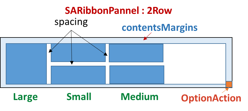
In 2-row mode, the medium and small placeholders (SARibbonPanelItem::RowProportion) are the same and not distinguished.
In single-row mode (new in v2.8.0), all buttons are arranged in a single horizontal row with icon on left and text on right. Large, Medium, and Small placeholders all behave as Small. It is recommended to enable SARibbonBar::setEnableIconRightText(true) for the best visual effect.
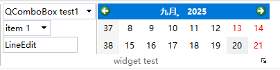
Adding Complex Controls (Widgets) in Panels
In addition to QAction, you can directly add any QWidget to the panel, such as combo boxes, spin boxes, or custom controls.
1 2 3 4 5 6 7 8 9 10 11 12 13 14 15 16 17 18 19 20 21 22 23 24 25 26 27 | |
The effect of the above code is as follows:
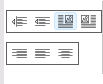
Using Button Groups
The button group SARibbonButtonGroupWidget can arrange multiple small buttons closely together, similar to QToolBar. It is often used for a group of similar functions, such as text alignment.
SARibbonButtonGroupWidget inherits from QToolBar. For actions in a button group, you don't need to bind signals to each action individually; you can use the QToolBar::actionTriggered signal.
The following code demonstrates how to create a button group and bind signals:
1 2 3 4 5 6 7 8 9 10 11 12 13 14 15 | |
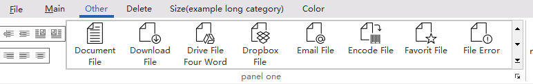
The above code generates the following interface (for specific examples, see example/MainWindowExample/mainWindow.cpp, createCategoryOther function):
Using Gallery
Gallery is a unique control in Ribbon, used to display icon options in a grid format. It is often used to display a large number of icon actions in limited space, such as style selection in Word.
The Gallery in SARibbon corresponds to the SARibbonGallery window. You can create a Gallery by using SARibbonPanel::addGallery, which returns a pointer to the created SARibbonGallery.
SARibbonGallery can manage multiple action groups. An action group corresponds to the SARibbonGalleryGroup class. You can use the SARibbonGallery::addCategoryActions method to quickly add action groups, whose parameters are the title of the action group and the action list of the action group.
1 | |
The following code demonstrates how to create a Gallery and add 2 action groups:
1 2 3 4 5 6 7 8 9 10 11 12 13 14 15 16 17 18 19 20 21 22 23 24 25 26 27 28 29 30 31 32 33 34 35 36 | |
The gallery created by the above code has the following effect:
The expanded effect of this gallery is as follows:
Context Category
Context Category is a special type of tab page that usually appears only under specific conditions (such as when an object is selected). The most common examples are "Picture Tools" and "Table Tools" in Word, which appear when a picture or table is selected. Such conditionally displayed tabs are called context tabs.
The Context Category in SARibbon corresponds to the SARibbonContextCategory window. You can create a Context Category by using SARibbonBar::addContextCategory, which returns a pointer to the created SARibbonContextCategory.
SARibbonContextCategory is not a window (its base class is QObject), but a tab page manager. You need to add tab pages to SARibbonContextCategory by using the SARibbonContextCategory::addCategoryPage method to add tab pages to the corresponding Context Category.
Context Category is not displayed by default. You need to call the SARibbonBar::showContextCategory method to display it. To hide the context tab page, you can use SARibbonBar::hideContextCategory. SARibbonContextCategory also has show/hide slot functions to show and hide the context tab page.
The following code demonstrates how to create a Context Category and add two tab pages:
1 2 3 4 5 6 7 8 9 10 11 12 13 14 | |
The Context Category created by the above code will not be displayed. If you need to display it, you need to trigger it under specific conditions:
1 2 3 4 5 6 7 8 9 10 11 | |
The effect of the above code is as follows:
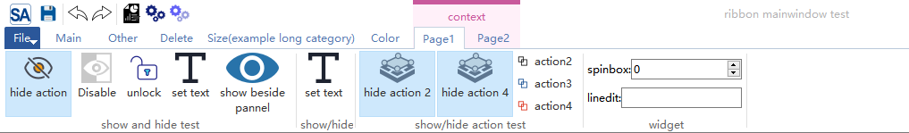
To distinguish context tab pages from ordinary tab pages, context tab pages are marked with a special color, as shown in the figure above. The color of this mark can be set via SARibbonBar::setContextCategoryColorList.
Application Button
The Application Button is the main menu button in the upper left corner of the Ribbon interface, usually used for "File" operations.
When creating a SARibbonBar, SARibbon will create a SARibbonApplicationButton instance by default as the Application Button. You can obtain a pointer to this button through the SARibbonBar::applicationButton method and perform operations on it, such as setting text, setting an icon, setting a shortcut key, setting a menu, etc.
For example:
1 2 3 4 5 6 7 8 9 10 11 12 13 | |
If you have a custom button, you can set the Application Button through the SARibbonBar::setApplicationButton method. If you don't want an Application Button, you can pass nullptr.
1 | |
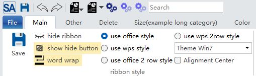
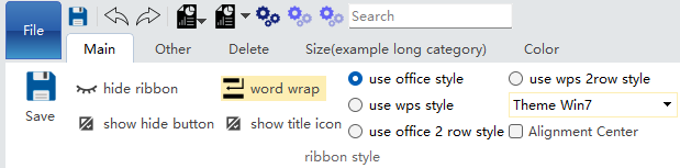
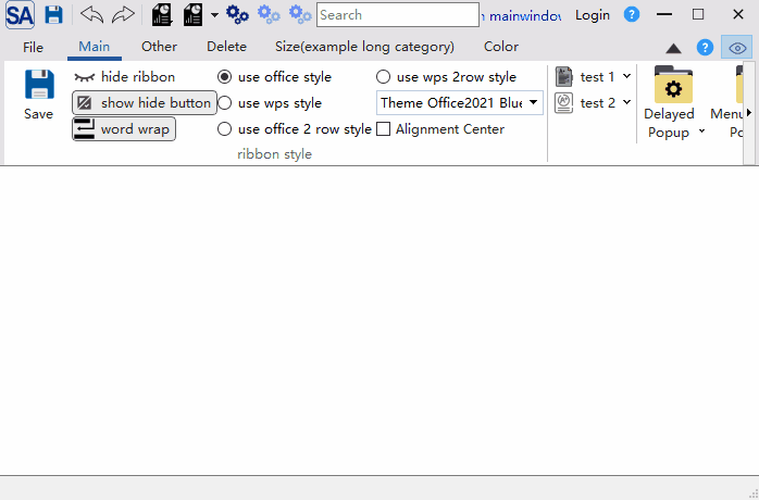
The application button can be styled richly using QSS. The following is a QSS demonstration imitating the Win7-style ribbon:
1 2 3 4 5 6 7 8 9 10 11 12 13 14 15 16 17 18 19 20 21 22 23 24 25 26 27 | |
The effect is as follows:
In loose mode, the Application Button can be set to vertical expansion. In this case, the Application Button will occupy the space of both the title bar and the tab bar.
Example:
1 | |
The effect of the above code is as shown in the figure:
Note
The SARibbonBar::setApplicationButtonVerticalExpansion function adjusts the visibility of titleIconWidget. If applicationButtonVerticalExpansion=true is set, titleIconWidget will be hidden; conversely, titleIconWidget will be displayed.
However, the SARibbonBar::setTitleIconVisible function does not affect the state of applicationButtonVerticalExpansion.
Therefore, if you dynamically adjust the state of applicationButtonVerticalExpansion and need to display the window icon, after setting setApplicationButtonVerticalExpansion(false), you must call setTitleIconVisible(true) to make the window icon visible.
Note
ApplicationButtonVerticalExpansion is only effective in loose mode (SARibbonBar::RibbonStyleLoose).
Application Widget
In many modern applications (such as Microsoft Office), clicking the Application Button does not pop up a simple drop-down menu, but a full-screen or half-screen complex page. This page can contain rich content such as a list of recent files, template selection, account settings, and application options.
SARibbon provides SARibbonApplicationWidget, which can automatically help you cover the main window. Your pop-up window can inherit from SARibbonApplicationWidget to implement this.
SARibbonApplicationWidget provides a resizeToParent function to determine how to scale relative to the parent window. By default, it completely covers the parent window. If you want to cover half or other sizes, you can override this function.
An example of using Application Widget is as follows:
Inherit SARibbonApplicationWidget to implement your own window:
1 2 3 4 5 6 7 | |
Create a member variable pointer m_appWidget of Application Widget in MainWindow, and bind the response of applicationButton during initialization:
1 2 3 4 5 6 7 8 9 10 11 12 13 14 15 16 | |
The effect of the above code is as follows:
API Summary
| Method | Return Value | Description |
|---|---|---|
SARibbonApplicationWidget(SARibbonMainWindow* parent) |
Constructor | Create an application widget |
resizeToParent(const QSize& parentSize) |
void | Scale relative to parent window (overridable) |
eventFilter(QObject*, QEvent*) |
bool | Filter parent window events |
showEvent(QShowEvent*) |
void | Handle show events |
keyPressEvent(QKeyEvent*) |
void | Handle keyboard events (ESC to close) |
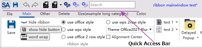
Quick Access Bar
The Quick Access Toolbar is located at the top of the window and is used to place the most commonly used operations, such as save, undo, and redo. The class corresponding to the Quick Access Toolbar is SARibbonQuickAccessBar, which inherits from QToolBar and can be used like a toolbar.
SARibbon creates a Quick Access Toolbar by default. You can call the SARibbonBar::quickAccessBar function to obtain a pointer to the Quick Access Toolbar and then operate on it.
The following is an example of using the Quick Access Toolbar:
1 2 3 4 5 6 7 8 9 10 11 12 13 14 15 16 17 18 19 20 21 22 23 24 25 26 27 28 29 30 31 32 33 34 | |
The above code creates a Quick Access Toolbar with the following effect:
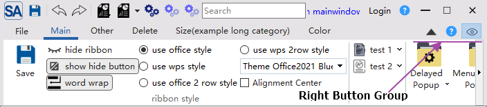
Right Button Group
The Right Button Group is the button group in the upper right corner of the Ribbon interface, usually used for operations such as "Help", "Settings", and "About". The class corresponding to the Right Button Group is SARibbonButtonGroupWidget, which inherits from QToolBar and can be used like a toolbar.
SARibbon creates a Right Button Group by default. You can call the SARibbonBar::rightButtonGroup function to obtain a pointer to the Right Button Group and then operate on it.
The following is an example of using the Right Button Group:
1 2 3 4 5 6 7 8 9 | |
The effect of the Right Button Group is as follows:
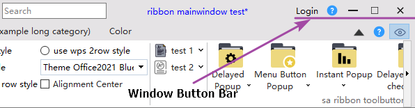
Window Button Bar
The Window Button Bar is the toolbar next to the system title bar buttons in the Ribbon interface. The class name corresponding to the Window Button Bar is SARibbonSystemButtonBar. It creates the necessary maximize, minimize, and close buttons for the window by default. It automatically adjusts the display of system buttons according to the window state. SARibbonSystemButtonBar has a SARibbonButtonGroupWidget inside, which provides functions such as addAction, addSeparator, and addWidget for adding buttons next to the maximize and minimize buttons.
You can obtain the SARibbonSystemButtonBar pointer through the windowButtonBar function of SARibbonMainWindow.
Note
SARibbonSystemButtonBar is not a child window of SARibbonBar, but a child window of SARibbonMainWindow.
An example of using SARibbonSystemButtonBar is as follows:
1 2 3 4 5 6 7 8 9 10 11 12 | |
The effect of the above code is as follows:
SARibbonMenu Detailed Usage
SARibbonMenu is a menu class designed specifically for Ribbon interfaces, inheriting from QMenu. It can be styled independently via StyleSheet without affecting the global QMenu style, making it suitable for use in Ribbon environments.
Differences from QMenu
| Feature | QMenu | SARibbonMenu |
|---|---|---|
| Style isolation | QSS affects all QMenu instances | Only affects SARibbonMenu instances |
| Submenu type | Returns plain QMenu | Returns SARibbonMenu |
| Widget support | Supports addWidget | Provides addWidget method |
API Summary
| Method | Return Value | Description |
|---|---|---|
SARibbonMenu(QWidget* parent) |
Constructor | Create an empty menu |
SARibbonMenu(const QString& title, QWidget* parent) |
Constructor | Create a menu with a title |
addRibbonMenu(SARibbonMenu* menu) |
QAction* |
Add an existing SARibbonMenu as a submenu |
addRibbonMenu(const QString& title) |
SARibbonMenu* |
Create and add a submenu with the specified title |
addRibbonMenu(const QIcon& icon, const QString& title) |
SARibbonMenu* |
Create and add a submenu with an icon and title |
addWidget(QWidget* w) |
QAction* |
Add a custom widget to the menu |
Code Example
1 2 3 4 5 6 7 8 9 10 11 12 13 14 15 16 17 18 19 20 21 22 23 24 25 26 27 | |
SARibbonGalleryGroup API Details
SARibbonGalleryGroup is an action group within the Gallery control, inheriting from QListView. It is responsible for displaying and managing a set of SARibbonGalleryItem in a grid format.
Enum Types
GalleryGroupStyle Display Style
| Enum Value | Description |
|---|---|
IconWithText |
Icon + text (text displayed in one line) |
IconWithWordWrapText |
Icon + word-wrapped text (only effective under DisplayOneRow) |
IconOnly |
Display icon only |
DisplayRow Display Row Count
| Enum Value | Description |
|---|---|
DisplayOneRow (1) |
Display 1 row (default) |
DisplayTwoRow (2) |
Display 2 rows |
DisplayThreeRow (3) |
Display 3 rows |
API Summary
| Method | Return Value | Description |
|---|---|---|
setGalleryGroupStyle(GalleryGroupStyle) |
void | Set the display style |
galleryGroupStyle() |
GalleryGroupStyle |
Get the current display style |
setDisplayRow(DisplayRow) |
void | Set the number of display rows |
displayRow() |
DisplayRow |
Get the current number of display rows |
setGridMinimumWidth(int) |
void | Set the minimum grid width (default 0: no limit) |
gridMinimumWidth() |
int | Get the minimum grid width |
setGridMaximumWidth(int) |
void | Set the maximum grid width (default 0: no limit) |
gridMaximumWidth() |
int | Get the maximum grid width |
addItem(const QString&, const QIcon&) |
void | Add an item |
addItem(SARibbonGalleryItem*) |
void | Add an item object |
addActionItem(QAction*) |
void | Add a QAction as an item |
addActionItemList(const QList<QAction*>&) |
void | Batch add QAction items |
removeActionItem(QAction*) |
bool | Remove the specified QAction item |
setGroupTitle(const QString&) |
void | Set the group title |
groupTitle() |
QString | Get the group title |
groupModel() |
SARibbonGalleryGroupModel* |
Get the underlying model |
actionGroup() |
QActionGroup* |
Get the managed QActionGroup |
gridRowCount() |
int | Get the number of grid rows |
gridColumnCount() |
int | Get the number of grid columns |
selectByIndex(int) |
void | Select an item by index |
recalcGridSize() |
void | Recalculate grid size |
preferredHeightForWidth(int) |
int | Get the preferred height for a given width |
Code Example
1 2 3 4 5 6 7 8 9 10 11 12 13 14 15 16 17 | |
SARibbonGalleryItem Usage
SARibbonGalleryItem is a single data item in the Gallery, similar to QStandardItem. It is used to set icons, text, associated actions, and other data.
API Summary
| Method | Return Value | Description |
|---|---|---|
SARibbonGalleryItem() |
Constructor | Create an empty item |
SARibbonGalleryItem(const QString&, const QIcon&) |
Constructor | Create an item with text and icon |
SARibbonGalleryItem(QAction*) |
Constructor | Create from a QAction |
setText(const QString&) |
void | Set the text |
text() |
QString | Get the text |
setToolTip(const QString&) |
void | Set the tooltip |
toolTip() |
QString | Get the tooltip |
setIcon(const QIcon&) |
void | Set the icon |
icon() |
QIcon | Get the icon |
setAction(QAction*) |
void | Set the associated action |
action() |
QAction* |
Get the associated action |
setSelectable(bool) |
void | Set whether the item is selectable |
isSelectable() |
bool | Whether the item is selectable |
setEnable(bool) |
void | Set whether the item is enabled |
isEnable() |
bool | Whether the item is enabled |
setTextAlignment(Qt::Alignment) |
void | Set the text alignment |
textAlignment() |
Qt::Alignment |
Get the text alignment |
setData(int role, const QVariant&) |
void | Set data for the specified role |
data(int role) |
QVariant | Get data for the specified role |
Code Example
1 2 3 4 5 6 7 8 9 10 11 12 13 14 15 16 17 18 19 | |
SARibbonGalleryViewport Details
SARibbonGalleryViewport is the viewport window that displays all GalleryGroups when SARibbonGallery is expanded, inheriting from QScrollArea. It uses a vertical layout internally to manage multiple GalleryGroups.
API Summary
| Method | Return Value | Description |
|---|---|---|
addWidget(QWidget*) |
void | Add a widget (without title) |
addWidget(QWidget*, const QString&) |
void | Add a widget with a title |
titleLabel(QWidget*) |
QLabel* |
Get the title label corresponding to the widget |
removeWidget(QWidget*) |
void | Remove a widget |
galleryGroupList() |
QList<SARibbonGalleryGroup*> |
Get all GalleryGroups |
galleryHeight() |
int | Get the Gallery height |
heightHintForWidth(int) |
int | Get the recommended height based on width |
Code Example
1 2 3 4 5 6 7 8 9 10 11 12 13 14 15 16 17 18 19 20 21 | |
SARibbonSystemButtonBar Detailed Methods
SARibbonSystemButtonBar is the system button bar on the right side of the window title bar, containing minimize, maximize, and close buttons. It also supports adding custom buttons and widgets.
API Summary
| Method | Return Value | Description |
|---|---|---|
addAction(QAction*) |
void | Add an action button |
addMenuAction(QAction*, popupMode) |
void | Add a menu action |
addMenuAction(QMenu*, popupMode) |
QAction* |
Add a menu and return the menu action |
addSeparator() |
QAction* |
Add a separator |
addWidget(QWidget*) |
QAction* |
Add a custom widget |
setupMinimizeButton(bool) |
void | Set the visibility of the minimize button |
setupMaximizeButton(bool) |
void | Set the visibility of the maximize button |
setupCloseButton(bool) |
void | Set the visibility of the close button |
setButtonWidthStretch(close, max, min) |
void | Set the button width ratio |
setWindowTitleHeight(int) |
void | Set the title bar height |
windowTitleHeight() |
int | Get the title bar height |
setWindowButtonWidth(int) |
void | Set the system button width |
windowButtonWidth() |
int | Get the system button width |
setWindowStates(Qt::WindowStates) |
void | Set the window state |
windowButtonFlags() |
Qt::WindowFlags |
Get the button flags |
minimizeButton() |
QAbstractButton* |
Get the minimize button |
maximizeButton() |
QAbstractButton* |
Get the maximize button |
closeButton() |
QAbstractButton* |
Get the close button |
setIconSize(const QSize&) |
void | Set the icon size |
iconSize() |
QSize | Get the icon size |
updateWindowFlag() |
void | Update window flags |
Code Example
1 2 3 4 5 6 7 8 9 10 11 12 13 14 15 16 17 18 19 20 21 22 23 24 25 26 27 28 29 30 31 32 | |