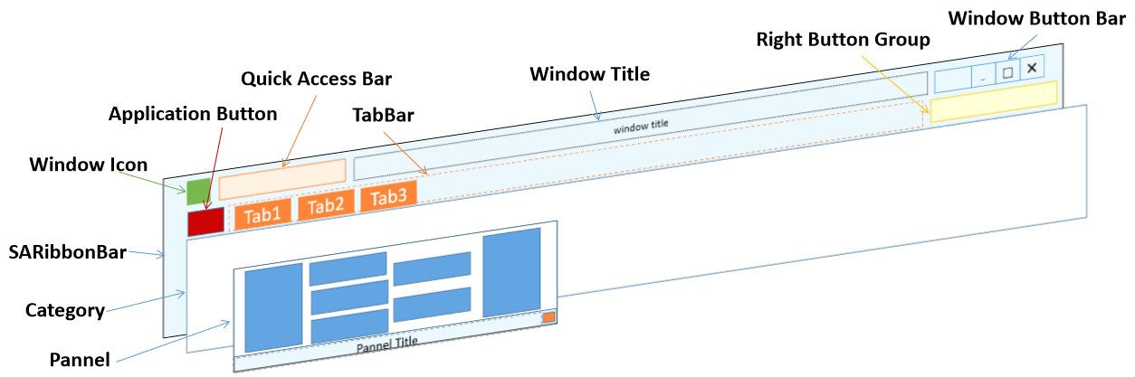
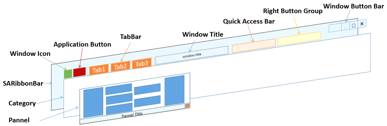
SARibbon Layout Methods
- ✅ Six layout schemes: Loose 3-row, Loose 2-row, Compact 3-row, Compact 2-row, Loose Single-row, Compact Single-row, switchable at runtime
- ✅ Combinatorial control: setTabOnTitle + setEnableShowPanelTitle + setPanelLayoutMode + setEnableWordWrap + setEnableIconRightText
- ✅ Panel three row proportions: Large/Medium/Small, all effective in 3-row mode, Medium equals Small in 2-row, all equal Small in single-row
- ✅ Word-wrap control: setEnableWordWrap toggles button text wrapping, recommended off in 2-row mode
- ✅ Icon-right-text control: setEnableIconRightText enables horizontal layout with icon on left, text on right in single-row mode
- ✅ Layout recommendations: Loose for frameless, Compact for native frame/embedded, SingleRow for space-constrained scenarios
Layout Selection Decision Flow
Choose the appropriate layout scheme based on your window type and requirements:
flowchart TD
    A[Choose layout scheme] --> B{Window type?}
    B -->|SARibbonMainWindow frameless| C[Loose layout]
    B -->|SARibbonMainWindow native frame| D[Compact layout]
    B -->|SARibbonWidget embedded| D
    C --> E{Button text length?}
    D --> E
    E -->|Short Chinese text| F[RibbonStyleLooseTwoRow / RibbonStyleCompactTwoRow]
    E -->|Long English text| G[RibbonStyleLooseThreeRow / RibbonStyleCompactThreeRow]
    E -->|Space extremely limited| J[RibbonStyleLooseSingleRow / RibbonStyleCompactSingleRow]
    G --> H[Enable setEnableWordWrap]
    F --> I[Disable setEnableWordWrap]
    J --> K[Enable setEnableIconRightText]
SARibbon supports six layout schemes: loose three-row, loose two-row, compact three-row, compact two-row, loose single-row, and compact single-row. You can dynamically switch between these modes.
Layout Scheme Quick Reference
| Layout Scheme | Enum Value | Characteristics | Recommended Scenario |
|---|---|---|---|
| Loose 3-row | RibbonStyleLooseThreeRow |
Separate title bar + Tab bar + 3-row Panel | Traditional Office style, many function buttons |
| Loose 2-row | RibbonStyleLooseTwoRow |
Separate title bar + Tab bar + 2-row Panel | Limited screen height but need title bar |
| Compact 3-row | RibbonStyleCompactThreeRow |
Tab bar merged with title + 3-row Panel | WPS style, saves vertical space |
| Compact 2-row | RibbonStyleCompactTwoRow |
Tab bar merged with title + 2-row Panel | Most compact, for embedded or small windows |
| Loose Single-row | RibbonStyleLooseSingleRow |
Separate title bar + Tab bar + 1-row Panel | Space extremely limited, icon + text horizontal |
| Compact Single-row | RibbonStyleCompactSingleRow |
Tab bar merged with title + 1-row Panel | Minimal layout, Panel only one row of buttons |
How to choose a layout scheme
- SARibbonMainWindow with frameless mode: use Loose layout, since the title bar is drawn by SARibbon
- SARibbonMainWindow with native frame (
UseNativeFrame): use Compact layout, to avoid title bar whitespace - SARibbonWidget embedded in other windows: use Compact layout
- Space extremely limited (embedded devices, small windows): use SingleRow layout, combined with
setEnableIconRightText
SARibbon Layout Settings
SARibbon provides the SARibbonBar::setRibbonStyle function to define the current layout scheme. The enum SARibbonBar::RibbonStyleFlag defines six layout options:
The style enumeration definitions of SARibbon are as follows (located in SARibbonBar):
1 2 3 4 5 6 7 8 9 10 11 12 13 14 15 | |
SARibbonBar::RibbonStyleLooseThreeRow: Loose structure, 3-row mode (equivalent toSARibbonBar::OfficeStylein v0.x version)
SARibbonBar::RibbonStyleLooseTwoRow: Loose structure, 2-row mode (equivalent toSARibbonBar::OfficeStyleTwoRowin v0.x version) (with text wrapping effect)
SARibbonBar::RibbonStyleCompactThreeRow: Compact structure, 3-row mode (equivalent toSARibbonBar::WpsLiteStylein v0.x version)
SARibbonBar::RibbonStyleCompactTwoRow: Compact structure, 2-row mode (equivalent toSARibbonBar::WpsLiteStyleTwoRowin v0.x version) (with text wrapping effect)

As can be seen above, in the 2-row mode, text wrapping will cause the icons to be very small. Therefore, it is recommended not to use text wrapping in 2-row mode. You can set whether to wrap text through the SARibbonBar::setEnableWordWrap function.
-
SARibbonBar::RibbonStyleLooseSingleRow: Loose structure, 1-row mode, buttons arranged horizontally with icon on left and text on right -
SARibbonBar::RibbonStyleCompactSingleRow: Compact structure, 1-row mode, Tab bar merged with title, buttons arranged horizontally
Single-row mode characteristics:
- All buttons (Large, Medium, Small) behave as Small horizontal layout with icon on left, text on right
- Panel titles are hidden by default, can be forced to show via
setEnableShowPanelTitle(true) - Text does not wrap
- Most height-efficient, suitable for embedded devices or windows with extremely limited space
- Recommended to enable
SARibbonBar::setEnableIconRightText(true)to ensure all buttons use horizontal icon-left, text-right layout
The setRibbonStyle function is actually a combination of layout control functions. Its approximate implementation is as follows:
1 2 3 4 5 6 7 8 9 10 11 12 13 | |
As you can see, the SARibbonBar layout is mainly controlled through the combination of these five functions: setTabOnTitle, setEnableShowPanelTitle, setPanelLayoutMode, setEnableWordWrap, and setEnableIconRightText.
These five functions have the following main purposes:
SARibbonBar::setTabOnTitle: Set whether to place tab bar buttons on the title barSARibbonBar::setEnableShowPanelTitle: Set whether to show the panel title at the bottomSARibbonBar::setPanelLayoutMode: Set the panel layout mode (3-row, 2-row, or single-row)SARibbonBar::setEnableWordWrap: Set whether button text can wrapSARibbonBar::setEnableIconRightText: Set whether buttons use horizontal layout with icon on left, text on right; enabled by default in single-row mode
For ribbon button layout details, refer to: Ribbon Button Layout Guide
Widget Arrangement Under Different Layouts
Built-in ribbon controls have different arrangement forms depending on the layout mode.
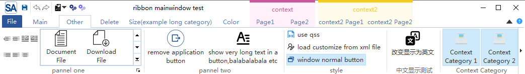
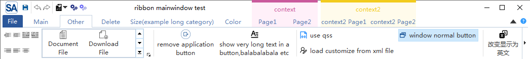
In loose mode, the arrangement of each control is shown in the following figure:
In SARibbon, the layout that combines the title bar and tab is called compact layout (Compact). The arrangement of each control in compact mode is shown in the following figure:
When using SARibbonWidget, it is recommended to use compact mode to avoid large blank spaces in the title bar.
When using native border (SARibbonMainWindowStyleFlag::UseRibbonMenuBar|SARibbonMainWindowStyleFlag::UseNativeFrame), it is recommended to use compact mode to avoid large blank spaces in the title bar.
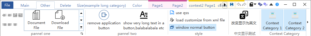
You can run the example/MainWindowExample example to set different styles and observe different ribbon styles and layout changes.
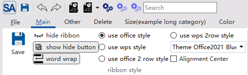
In this example, you can click the use office style, use wps style, use office 2row style, use wps 2row style, and use single row style buttons to see how different ribbon styles and layouts change.
Panel Layout Schemes
SARibbonPanel provides three layout modes through PanelLayoutMode:
1 2 3 4 5 6 | |
3-row Mode
The 3-row mode is the traditional panel layout method. It has three row proportions: Large, Medium, and Small. Panel titles are shown by default.
2-row Mode
In the 2-row mode, Medium and Small row proportions are the same and not distinguished. Panel titles are hidden by default.
2-row Mode Notes
By default in 2-row mode, panels do not show titles, but you can enable panel title display through the SARibbonBar::setEnableShowPanelTitle function. Similarly, in 3-row mode you can also hide titles through this function.
Single-row Mode
Single-row mode is a new layout scheme introduced in v2.8.0. All buttons are arranged in a single horizontal row with icon on the left and text on the right, suitable for space-constrained scenarios.
In single-row mode, Large, Medium, and Small row proportions all behave as Small, with no distinction. All buttons use horizontal layout (icon-left, text-right).
Single-row Mode Notes
- Panel titles are hidden by default in single-row mode
- It is recommended to enable
SARibbonBar::setEnableIconRightText(true)to ensure all buttons use horizontal icon-left, text-right layout - Text does not wrap in single-row mode; long text buttons will be truncated
Dynamic Layout Switching Example
1 2 3 4 5 6 7 8 9 10 11 12 13 14 15 16 17 18 19 20 21 22 23 24 | |
You can also combine the five underlying functions for more flexible custom layouts:
1 2 3 4 5 6 7 | |